Background
The Advisory Board has worked with the team for several years on multiple projects per year. The trend has always been to iterate on specific areas of their websites, constantly testing and improving it.
Business Problem
Several years after their first redesign, Advisory found it was time to reconfigure the navigation. Their analytics told them that visitors were not using it and unfortunately, the users found the navigation confusing, preferring to rely on their own bookmarks, and that site search just did not work for them
Role
UX Research | Wireframing | IA
Solution
I conducted a landscape analysis, stakeholder interviews, audience interviews, updated existing personas, held a card-sorting exercises with stakeholders, Treejack testing with audiences, reworked the sitemap and IA, built wireframes for two distinct directions, wrote user testing scripts, and designed a new navigation system.
Landscape analysis
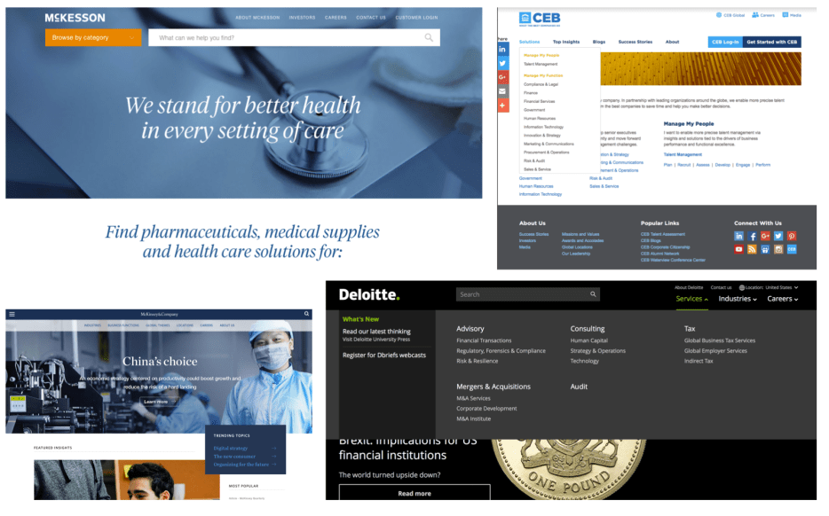
The landscape analysis taught me what competitors were doing well. Key takeaways were to try to reveal content in multiple ways for higher discoverability, megamenus are okay if they are scannable, using simple language is a must.
Stakeholder interview synthesis
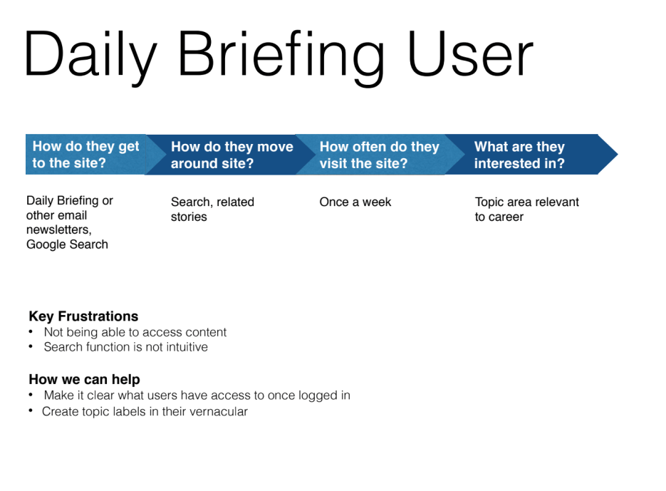
The interviews and card-sorting exercise revealed that most audiences were unaware of the differences between products and services, so the simplified information architecture aimed at separating specific products from more general focus areas and created a center for members to easily access all of their benefits. The member section also made it easier to see upcoming events users had signed up for and provided a clearer connection to emailed articles, which had a tendency to disappear if users had not saved them.
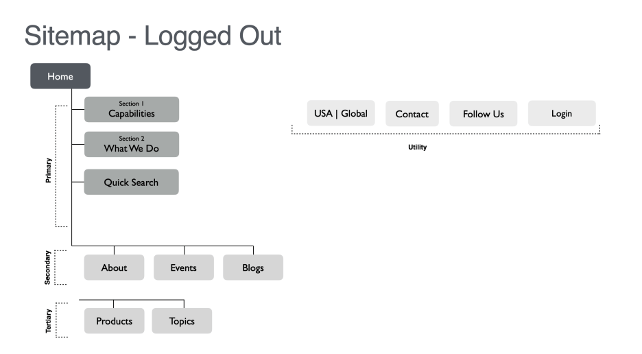
Suggested IA
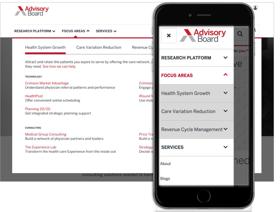
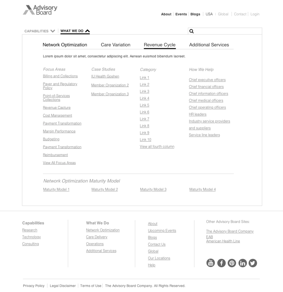
Mid-fidelity wireframes with new IA
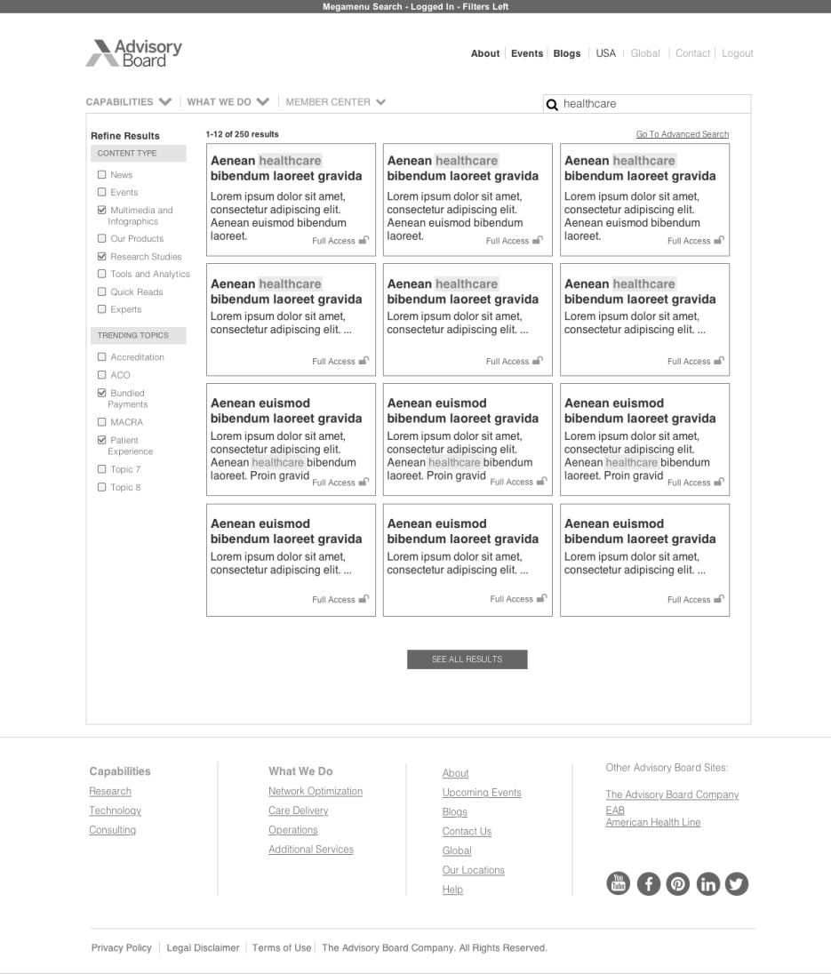
As an added bonus, and because users were complaining about search, I designed a new filtering system and card style for search to give users more control.
Below is the user flow for the new search I created. With a main goal of giving users more control, I wanted to ensure there were many opportunities for users to not only choose which results they wanted to see, but also give them immediate feedback.
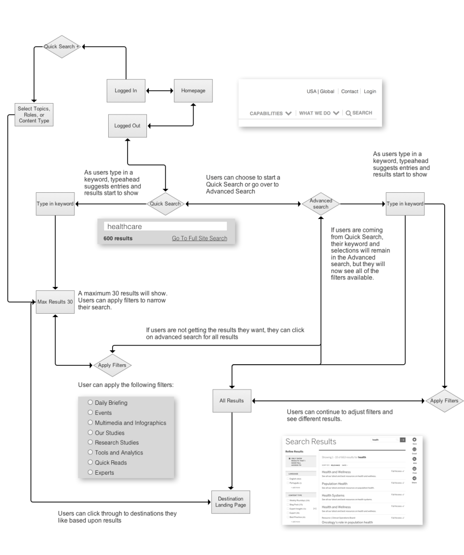
First, with the automatic narrowing of results and second, a highlight of the keyword they are searching for — instant feedback that they’ve found what they’re looking for.
Goals accomplished
- Clearer labeling and context for links in the navigation
- Better use of color to indicate actions
- Refreshed search to give users more control
- See the menu and search in action
Email Cydney to hear more about this project.


