 Business Problem
The State Department’s aging position-matching tool for Foreign Service officers was no longer meeting the standards of its varied users. This heavily-used tool helps match job seekers to positions at several distinct times throughout the year, career coaches manage clients, and bureaus advertise and recruit for positions.
User Problem
Foreign Service Officers must search for a new position every-other year, using a tool that is slow to load, difficult to navigate, with buried position descriptions, and no sense of where they are in a secret assignment process.
Role
UX Lead | UI Lead | Usability Testing | Scrum Master
Solution
Sprint-by-sprint, I continue to design features that help move users away from their dependency on the legacy system. While I did not create the personas or conduct the original stakeholder interviews, I have continued to push the design forward each sprint by creating new client views for career development officers, re-purposing the homepage to make it more meaningful, and guide product owners in prioritization workshops, among other accomplishments.
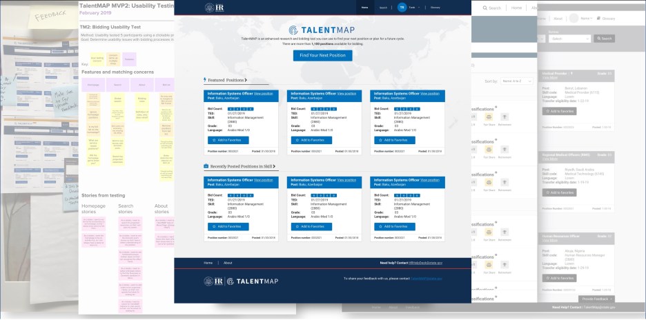
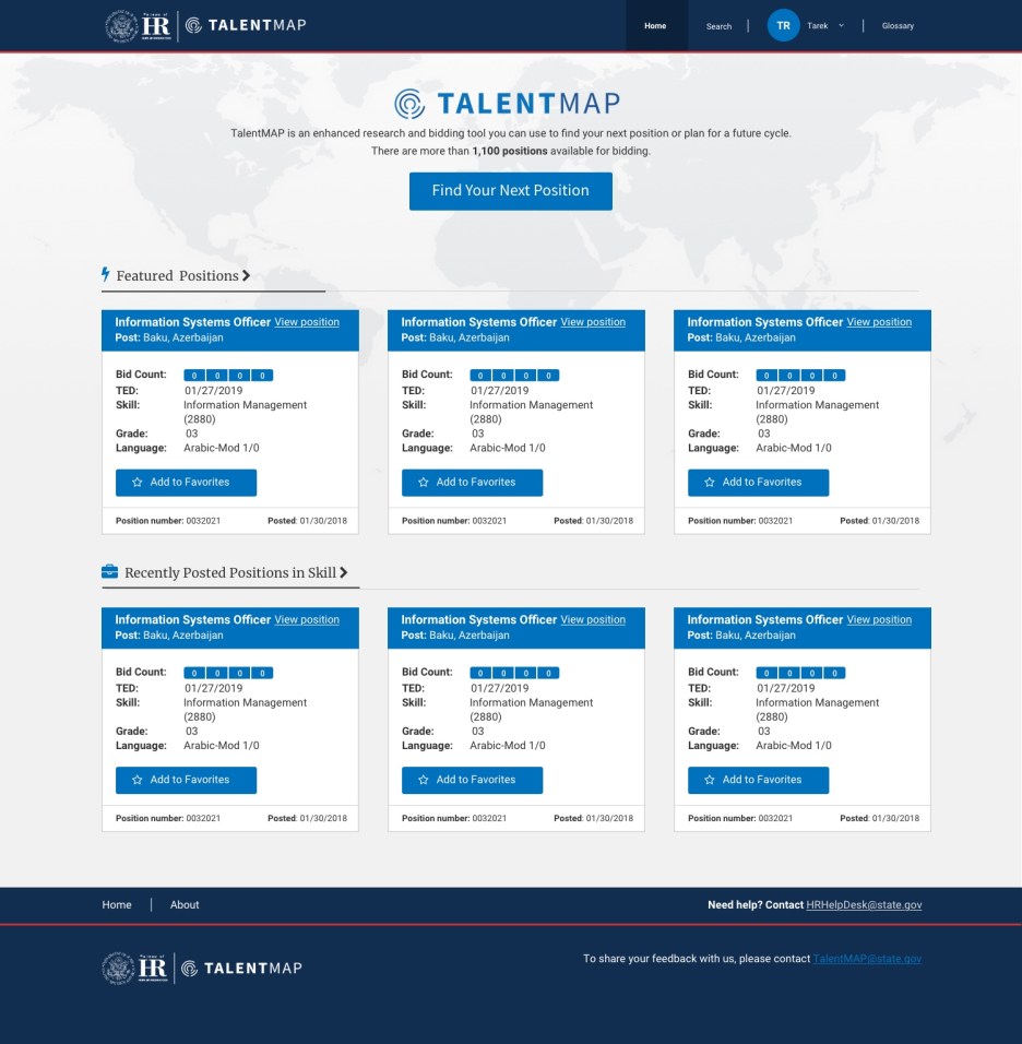
Here’s a gallery of the designs so far
Anatomy of a homepage redesign
Problem
Usability tests proved over and over again that the original homepage was confusing and they were missing the point of the suggested positions on the page.


- Users were baffled by the open search bar and thought they had to use the dropdown in order to search
- They were disoriented and didn’t know they were on the homepage
- The combination of the open search bar with the cards led them to believe a search had already been conducted
Process – Seek inspiration
- Research how other sites that specialize in job searching are designed
- Look at websites that have search as their primary focus
- Review sites that have great calls-to-action

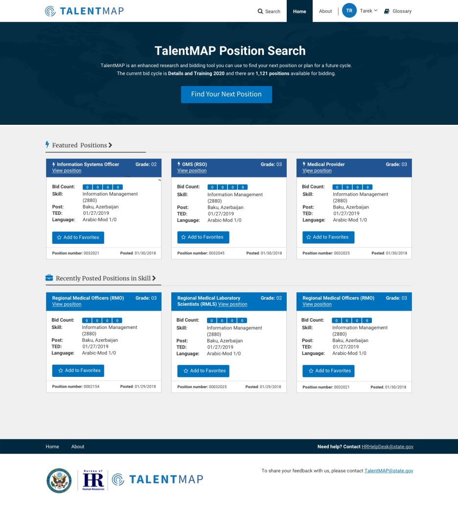
Solution
Get users to the well-tested position search as quickly as possible and help orient the users sooner.
Twist
A new business problem popped up when State informed me that they had standardized the design for the header of all tools and we needed to comply. The new header washed out the branding of our logo and made my new design top-heavy.
Second solution
A lighter call-to-action area provides better emphasis to the blue call-to-action button and the world map that once just added texture helps lead the user down the page to the featured positions section.
Goals accomplished
- Helped usher in the first release of the tool
- Lead multiple rounds of usability testing, including our first clickable prototype testing
- Doubled up design reviews – first with developers, second with clients
- Moved from wireframes to design quickly for developer and product owner understanding and approval
- Created visual product roadmap to help guide team in the right direction for releases
Email Cydney to hear more about this project.


